



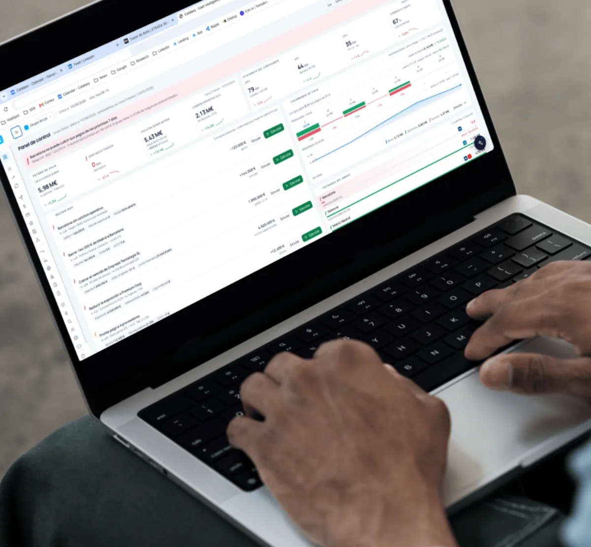
Catalaxy is a cash intelligence platform for small and midsize companies. A treasury tool is dense by nature, and the work was less about drawing screens than about fixing a common language and holding it across every one of them.
The challenge
Forecasting, reconciliation, collections, scenarios, reporting. A finance lead needs to see a lot at a glance, and a tool built for that faces two opposite failures: it says too little, or it buries you.
The real difficulty was scale. Each new module pulls at the consistency of the last one. If every screen solves its own problem in its own way, by the fifth module nobody knows where to look. So most of the work was not drawing screens. It was deciding how a number gets presented, when something counts as an alert, and what leads in any given view, then holding those answers across close to twenty modules.
The platform
Catalaxy is laid out as a cockpit. Concentrated information, clear hierarchy, quick to read.
The cockpit is the first thing you see on login: cash today, the forecast for the coming weeks, and what is waiting on a decision. From there you go down into detail, never the other way around. Since every company looks at a different thing first, the cards reorder and each user ends up with their own front page.
The common language
Before any module got designed, four things got settled and written down.
- How a figure is presented. Tabular numbers, one unit convention, the same rounding everywhere, so two screens showing the same balance show it the same way.
- When something is an alert. A threshold the product owns, rather than each screen deciding for itself what counts as urgent.
- What leads a view. One primary object per screen. Everything else supports it.
- What a recommended action looks like. Always with its cash impact attached, in the same place, in the same form.
Those four decisions are why the twentieth module is as readable as the second one.
What it covers
- Cash forecasting at 30, 90 and 180 days, with scenarios for a payment arriving late or a supplier being paid early.
- A prescriptive engine. Every recommended action arrives with its cash impact, so the list sorts itself by what actually moves the balance.
- Bank reconciliation over Open Banking, matched automatically.
- Collections aimed at bringing DSO down, with receivables and payables aging in view.
- Workflow automation by rule and alert, so the repetitive part stops depending on somebody remembering.
- Executive reporting and KPIs, waterfall analysis, budgets, audit trail and multi-entity.
Around the modules sits the rest of it: the configurable cockpit with vector charts for forecast, bars, waterfall and score rings, and a reusable design system in light and dark mode. The design system is the part that lets the next module look like the last one without anything being rebuilt.
Down to the detail
In a tool somebody opens every morning, the detail is what separates a demo from something people work in.
- Responsive down to phone without breaking, in every module.
- Keyboard accessibility: visible focus, full navigation, aria where it earns its place.
- Performance on screens that are genuinely dense with data.
- Unified terminology and consistent figures, reviewed with finance judgment rather than design judgment.
- Product strategy and architecture
- UX and UI design
- Design system and component library
- Dashboard and data visualization design
- High-fidelity prototypes
- Light and dark mode
- Responsive design
- Accessibility
The result
Catalaxy reads like a good product rather than a finance tool: a cockpit that orders a complicated domain and puts it within reach of a company without a treasury department, consistent end to end, able to take more modules without getting harder to read.
The site that explains it is covered in Catalaxy (Web).
Services applied