

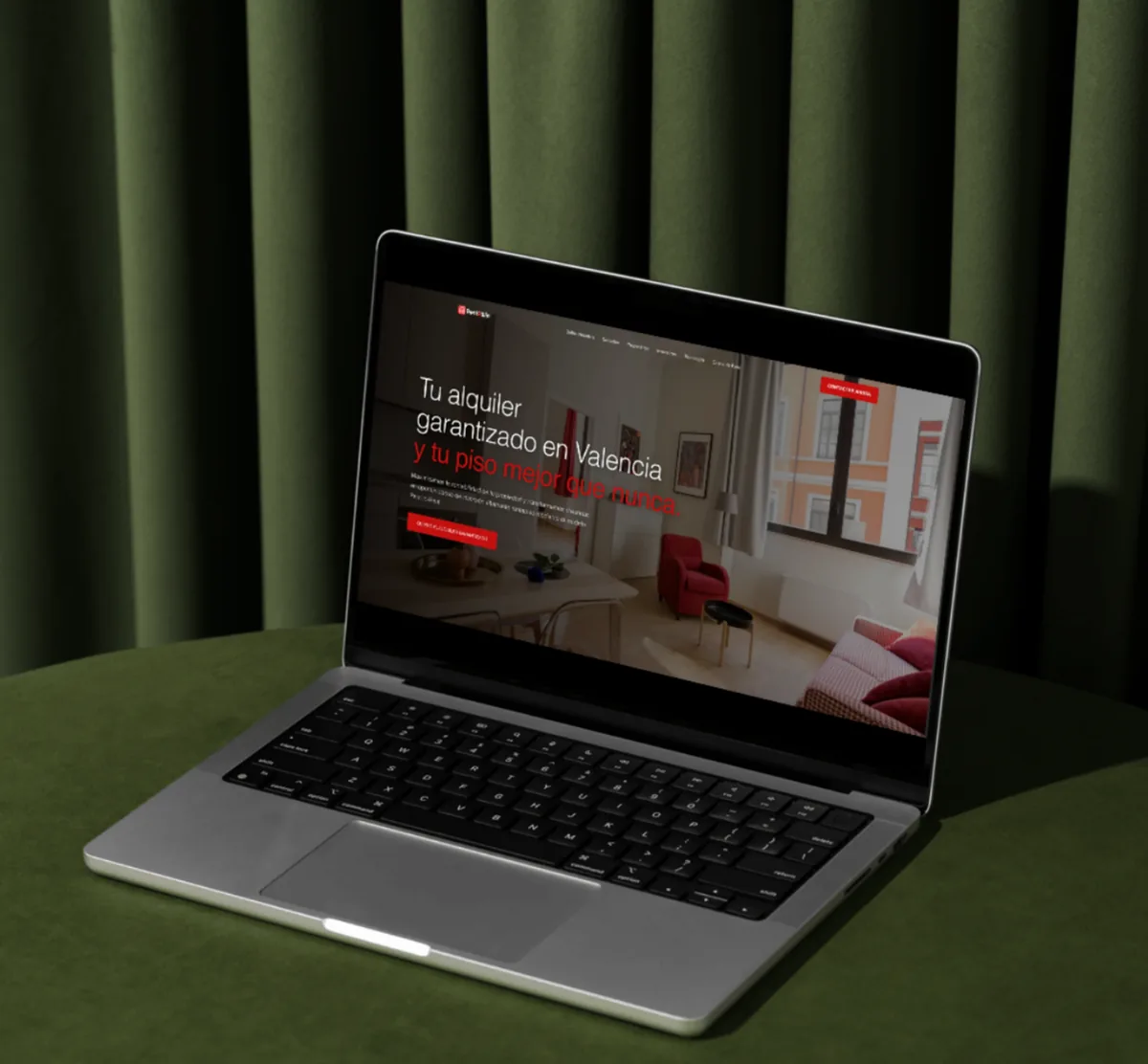
Rent2Win manages rental property and guarantees the rent to the owner. The site has to speak to three people at the same time, and each of them is reading for something different.
Where it started
Rent2Win manages rental property and guarantees the rent to the owner, which is a stronger promise than most managers make and therefore a harder one to be believed on. A promise like that invites the obvious question: how. If the site does not answer it in the same breath, the promise reads as marketing.
The audience problem compounds it. An owner is assessing risk. An investor is assessing returns and process. A tenant is assessing whether they will be dealt with fairly. Those three readings pull in different directions, and a site that averages them persuades nobody.
The challenge
Three audiences, one site. An owner wants to know the rent arrives whatever happens. An investor wants the numbers and the process. A tenant wants to know who they are dealing with. Write for one and you lose the other two.
And the reading all happens at the same moment, right before somebody decides to pick up the phone. Whatever the site conveys at that point is what the business gets.
How we worked
We separated the three audiences in the architecture rather than in the copy. Each gets a route from the home page and a page written for them, so nobody has to read past two paragraphs that were meant for someone else.
The design does the rest. A guaranteed-rent offer has to look like it comes from an organization that can stand behind it, and at this size that confidence comes from typography, spacing and restraint rather than from a list of logos.
The pages that do the work
The home page does one job: route the visitor. Three clear doors, named for the person going through them, with enough on each to be sure it is the right one.
From there the owner page handles the guarantee and what Rent2Win takes on. The investor page handles process and reporting. The tenant page handles the practical side of living in a managed property. Each is written for one reader, which is the only way any of them reads as though it was meant for you.
Contact sits on all of them, in the same place, because somebody can reach a decision on any one of the three.
What we did
We designed and built a custom corporate site, contemporary and deliberately plain about the offer.
- Three routes from the home page. Owners, investors and tenants each get their own path, rather than one page trying to serve everybody at once.
- The guarantee, stated clearly. What Rent2Win takes on and what it manages, written where it gets read.
- A finish that carries weight. Typography, spacing and detail doing the job that a logo cannot do on its own.
- Contact in reach everywhere. Because the decision does not happen on a single page.
- Web strategy and architecture
- UX and UI design
- Custom web development
- Messaging for three audiences
- Responsive design
What this one shows
- Multiple audiences get separate routes. Not a compromise page.
- A strong claim needs its mechanism next to it. Otherwise it works against you.
- Custom build, not a template. Because the structure here is the argument.
The result
Rent2Win has a site that speaks to owners, investors and tenants without flattening any of them, and that holds its ground at the point where someone decides to get in touch.
Services applied