


JICALAB formulates skincare with organic aloe vera from fields it farms itself. The product was there. The store was not helping: confusing navigation, loading errors and a look that worked against the jar.
Where it started
JICALAB grows its own organic aloe and formulates from it, which is a genuinely unusual position in skincare and a hard one to communicate in a product grid. The old store was doing the opposite of communicating it. Navigation that took three attempts to understand, loading errors on the pages that mattered, and a look that made a carefully made product read as a cheap one.
A catalog of twelve products and two bundles does not sound wide until you remember that each one has actives, usage, a full ingredient list and a reason to exist alongside the others. Get the organization wrong and a shopper who wanted one jar leaves with nothing.
The challenge
The store needed to be as carefully made as the formulas. That means three things at once: it has to earn trust, it has to make a wide catalog navigable, and it has to be able to grow with sales without being rebuilt every season.
The solution
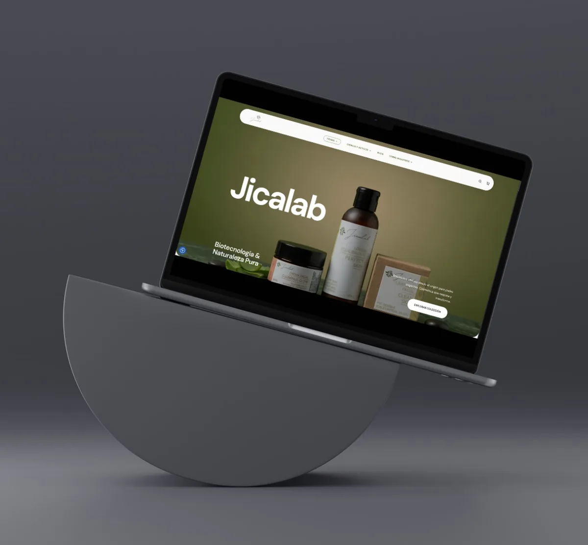
We designed and developed the entire store, with one visual system running through every page: considered typography, the JICALAB greens, and a finish that works with the product rather than against it.
More than twenty new pages, linked to each other, quick, and built for the phone, which is where most of this gets bought.
What we did
- Digital brand identity. Color, type and detail held to the same standard across the whole store.
- Architecture built for selling. Home, filtered catalog, category pages, detailed product pages and bundles, with the path to checkout cleared.
- Content that brings people in. Pages by skin concern, a blog and routine guides, which is what somebody searches before they have ever heard of the brand.
- Pieces that convert. Social video embedded, FAQs, and a welcome offer that starts building the subscriber list from day one.
- A real catalog, properly ordered. Twelve products and two bundles documented in full: actives, how to use, ingredients and prices.
- Performance and a clean migration. Fast loading, optimized images, tidy code, and the move handled so the URLs already ranking kept their value.
- Web strategy and architecture
- UX and UI design
- Digital brand identity redesign
- Ecommerce development, WordPress and Bricks
- Migration with SEO preserved
- Performance optimization
- Conversion optimization
- Product content writing
The migration
The store was replaced rather than patched, which means every address on it was at risk. Pages already ranking and bringing in sales had to keep doing that through the switch, so the URLs were mapped before the new store went anywhere near production and the old addresses point at whichever page now does their job.
It is unglamorous work and it is the part that protects the revenue the old store was already earning.
What this one shows
- A product page is a document. Actives, usage, ingredients and price, written out. Not three lines and a photograph.
- Organic search and the catalog are one job. Pages by skin concern are how somebody finds the brand before they know the brand.
- We treat a replatform as an SEO project. Because that is the half of it that can lose money.
The result
JICALAB has an ordered, quick store with the full catalog documented properly, and a base ready to start pushing online sales.
Services applied
- Web designSee the service
- SEOSee the service
- Optimization